HOW TO USE COLOR AND TEXTURE TO ELEVATE A LISTING
WHY VISUAL PERCEPTION DRIVES MARKET PERFORMANCE
In Manhattan real estate, first impressions are formed within seconds. In neighborhoods such as SoHo, Chelsea, and the Upper East Side, buyers are highly responsive to visual cues that signal quality, cohesion, and livability. Color and texture are among the most effective tools for shaping that perception, influencing not only how a property photographs but how it feels in person.
Sellers often ask whether cosmetic updates can truly impact pricing. The answer is yes, when executed strategically. Well-staged properties that use color and material thoughtfully tend to generate stronger engagement and higher offers. Reviewing listings through Daniel Blatman’s Manhattan property search consistently shows that presentation quality directly affects market performance.
COLOR AS A TOOL FOR SPACE, LIGHT, AND MOOD
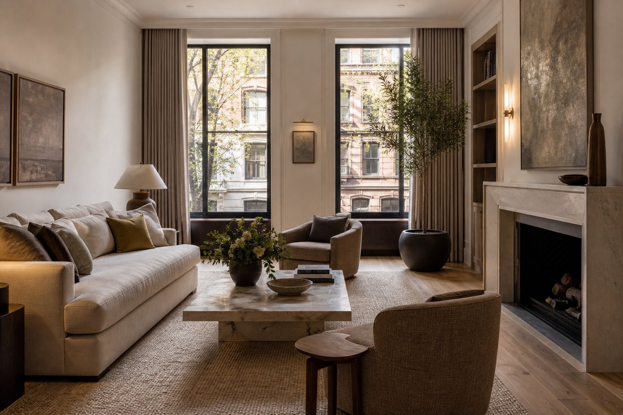
Color influences how space is perceived. Lighter, neutral palettes can make rooms feel larger and more open, while darker tones can add depth and sophistication when used selectively. In Manhattan apartments, where space and light vary significantly, color becomes a critical design decision.
A common question is whether bold colors help a listing stand out. In most cases, restraint performs better. Buyers prefer spaces that feel adaptable, allowing them to project their own aesthetic. Neutral tones create a versatile backdrop, while subtle accents can introduce character without overwhelming the space. Understanding light exposure, which can be influenced by surrounding buildings and zoning considerations outlined by the NYC Department of City Planning, also helps determine how colors will appear throughout the day.
TEXTURE: ADDING DEPTH WITHOUT CLUTTER
Texture plays a complementary role by adding visual interest without relying on color. Materials such as wood, stone, linen, and metal create layers that make a space feel curated and complete. In high-end Manhattan markets, texture often signals quality more effectively than decoration.
Sellers frequently ask how to incorporate texture without overdesigning. The key is balance. Combining a limited number of materials with varied finishes creates depth while maintaining clarity. In SoHo lofts, for example, exposed brick and steel beams provide natural texture that can be enhanced with soft furnishings. In newer developments, adding tactile elements can prevent spaces from feeling overly minimal or sterile.
SOHO: EMBRACING AUTHENTIC MATERIALS
SoHo properties benefit from their inherent architectural character. Exposed brick, cast-iron columns, and wide-plank floors provide a foundation for layered design. Color choices in these spaces should complement rather than compete with existing materials.
Buyers often ask whether to modernize or preserve original elements. In most cases, preservation adds value. Enhancing these features with neutral palettes and refined textures creates a cohesive aesthetic that appeals to design-conscious buyers. Landmark considerations from the New York City Landmarks Preservation Commission may also influence how materials are maintained or updated.
CHELSEA: CONTEMPORARY PALETTES AND CLEAN FINISHES
Chelsea’s newer developments often feature clean lines and modern finishes, which benefit from carefully curated color and texture. Soft neutrals, matte surfaces, and subtle contrasts help define space without disrupting the overall design.
A frequent question is how to avoid a generic appearance in modern units. Introducing texture through textiles, natural materials, and layered lighting can create warmth and distinction. Current listings on Daniel Blatman’s Chelsea properties demonstrate how small design adjustments can significantly elevate presentation.
UPPER EAST SIDE: CLASSIC ELEGANCE THROUGH MATERIAL CHOICE
On the Upper East Side, staging strategies often focus on reinforcing traditional elegance. Neutral palettes combined with rich materials such as wood, marble, and tailored fabrics create a sense of refinement that aligns with buyer expectations.
Sellers often ask whether to update or maintain classic interiors. The most effective approach is typically a combination of both. Preserving architectural details while introducing updated textures and finishes creates a balanced aesthetic that appeals to a broad audience. Building and renovation considerations can be reviewed through the New York City Department of Buildings.
HOW COLOR AND TEXTURE IMPACT VALUE AND DEMAND
Color and texture influence more than aesthetics. They shape how buyers emotionally connect with a space. A well-composed interior can make a property feel larger, brighter, and more functional, all of which contribute to perceived value.
A common question is whether these strategies translate into measurable results. Market behavior indicates that they do. Listings that photograph well and present cohesively tend to generate more interest, reduce time on market, and achieve stronger pricing.
For sellers, stagers, and real estate professionals, the goal is not decoration but alignment. Through Daniel Blatman’s NYC real estate expertise, clients can identify how to position a property visually to meet buyer expectations and maximize market performance. In Manhattan’s competitive landscape, thoughtful use of color and texture is a strategic advantage, not an afterthought.